

Some of you may have read our other Durban Answers blog posts discussing our ideology behind the platform, how it is going to improve lives and enable informed decision making, and about the events we’ve hosted to generate some of the content. This blog post is getting into a slightly more technical aspect of the project: designing the user interface of the back-end of the site.
What does this mean exactly? Well, very broadly, there are two distinct parts to a website: the front-end is the visible face that end-users see and interact with, while the back-end is the hidden machinery that employees and service-providers build and maintain in order to make the front-end look and work in a certain way. For Durban Answers the user will ask a question and get back a beautifully written, edited, and formatted, answer with all working links and maps and a host of other useful items. This is the front-end experience. The back-end of Durban Answers will comprise various concealed apparatus such as the interface for our contributors and editors to answers questions, the databases storing questions and answers, the server hosting and delivering all files, and the thousands of lines of code which performs every task and connects all of the different parts. The interface for the back-end is the vehicle for our team to access questions which have been asked, answer them efficiently, and publish those answers to the live site.
With that front-end versus back-end primer out of the way, let’s dig into the important part of this post. The execution of a civil web app is not unlike that of a broadway stage production: before the curtain is raised on opening night, weeks of blood, sweat, and tears goes into ideation, scriptwriting, stage design, venue hire, auditions, casting, choreography, and rehearsals. All of these phases are absolutely critical, and intentionally hidden from the end-users, at least at the time of the performance, and it is only once each of these phases are correctly executed that the live shows have any chance of receiving standing ovations and positive critical reviews. Imagine if the Chicago team had proceeded with venue hire before locking down the requirements of stage design. Or how would Cats have turned out if the casting was finalised before the scriptwriting was completed? The point is that, unless you are exceptionally lucky and risk-seeking, there are many fundamental phases in the web design process which deeply inform other phases down the line, and without giving due consideration to each phase at the right time you are extremely likely to have multiple costly “Oh no, why didn’t we think about that before we started this item” moments.
So, the broadway stage example makes sense but what are the equivalent precursor steps which should go into launching a website or app? These would be phases like:
- Research and planning, including
- Requirements analysis
- Information architecture
- Relevant technologies and frameworks selection
- Specifications and/or features documents creation
- Translation of the outcome of the Research and Planning phase into comprehensive briefs for service providers
- These briefs are absolutely critical as they inform external providers on important points such as what your project is attempting to achieve and why, what their specific roles and responsibilities will be, timeframe and budget information, design likes and dislikes which they should be aware of
- Designing
- Developing
- Testing
- Launching
The rest of this blog post is going to specifically focus on Step 2, writing a design brief. Because Durban Answers already had a rough earlier version of the front-end designed in-house we decided to start writing the brief for the design of the back-end interface first (remember, the back-end interface is how our Durban Answers contributors will answer, edit, and publish questions). Writing a design brief for a front-end interface would follow a virtually identical process.
Right, now designing a back-end user interface is like designing any website, just less sexy. In my own experience, I find some back-end platforms cluttered and hard to use, and the current backend interface for Durban Answers has basically no user experience, so my initial point of entry to this process was to research “what makes a good user experience?” Most of the examples I found brought up sites with outward facing content, but not very many examples of “contributor” user experiences, essentially showing designs and user experience best practices for the end-users, not our contributors. There are TONS of examples of amazing and edgy design portfolios for this type of web design, but I was looking for something slightly different: an example of a back-end user interface.
It’s worth mentioning at this point that the type of website Durban Answers will be is called a Content Management System (CMS). Wikipedia describes a CMS as “a computer application that supports the creation and modification of digital content. It is often used to support multiple users working in a collaborative environment”. WordPress is the most famous and popular example of a CMS framework. I’m not a designer, a developer, nor an expert on user interface or user experience. I’m a social scientist, a writer, a conceptual thinker, and a visual person, so I really felt like I needed to do some reading on latest trends in CMS design and how user experience principles are being incorporated into these designs. But outside of understanding best practices of CMS design, my challenge was not only to design a CMS interface with good user experience principles, but to put all of this into a design brief for our designer to be able to understand and run with. But how do you design a user experience for a tool that is used for designing websites? Kind of mind-blowing really. After feeling a bit like I had gotten nowhere in my research, I called in our designer and our developer and asked for a bit of guidance.
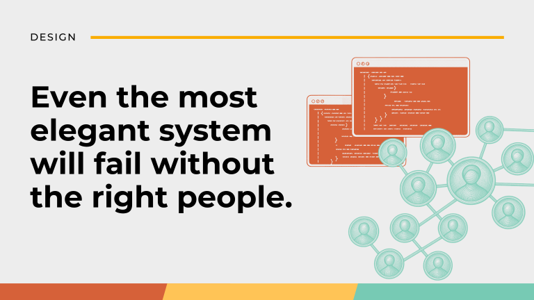
LESSON 1: Choose the right designer for your project. This step is often overlooked but should arguably take up the largest amount of time in your involvement in the design process. Investing in a competent and appropriate designer is a wise investment which will pay dividends at multiple stages throughout the life of your project. Here are some qualities to look for in a designer:
- Appropriately experienced — you are paying for guidance and leadership in a diverse set of areas
- Humble and respectful — their involvement is not an opportunity for their self-expression or inflating their ego, it is to solve a specific set of problems you have in a courteous and friendly way
- Curious and empathetic — ideally you want them to passionately buy into the resolution of the problem you need solved, they will do this best by placing themselves in the shoes of you and your users
- Fantastic problem-solver — this one is a no-brainer: at a high-level this is the main role of the designer on multiple levels and likely across many areas
- Excellent communicator — they may have the best ideas in the world, but if they can’t communicate them to you they are effectively useless
LESSON 2: Ask for help from those who know what goes into design brief, and who understand what type of web platform you are designing. If you can understand what type of information they will need from you, more than likely they will be able to give you a good place to start.
This meeting was extremely fruitful. Firstly, I figured out that I was spending too much emphasis on “design principles” rather than how the actual site is going to be structured. Never be silent on a question or issue which you don’t understand or are not sure about. The designer should be there to respectfully hold your hand throughout the briefing and greater design process. If the finished product at the end of the day is inferior or inefficient as a result of a poorly written brief that entirely due to incompetence of the designer. Part of the designer’s job is to completely understand the project’s design requirements, roles and responsibilities. If they fail to achieve this the blame should lie squarely on their shoulders, not yours.
LESSON 3: Leave the designing to the designer. Don’t spend time teaching yourself about web design, design principles, or learning how to use a design tool in order to write your design brief. Let the designer do what they do best. Your job is to tell them what you require, what you would like to have, and what you definitely don’t want. Pulling examples of designs you like (and don’t like) is the best way to communicate about your design preferences. I did a lot of screen-shotting.
I learned about something called the “Information Architecture” (IA) which is essentially how information gets captured, by whom, for whom, how does it travel, and where does it end up? This might sound quite broad or dense (which it is!) but crucial to being able to design the IA is identifying what the information is that is moving, and then you map it out from there. For us, the information that moves is an answer. In order to map out all the potential scenarios and paths that answers could take, I spent a lot of time drawing out diagrams the old fashioned way: with paper and pencil.
LESSON 4: Don’t be afraid to use pencil and paper to do your mapping.
I did quite a few of these drawings and worked closely with our developer to make sure I was covering all my bases. Overall, this mapping exercise took a few rounds of drawing, presenting, and drawing again. Even though it was quite dense and difficult at times, this Information Architecture is absolutely crucial to get right early on.
LESSON 5: Try to include the following areas in your design briefs:
- A short description of the project or your company, depending on what the product is being designed for. Ours was a project description since the product is for a project, not the entire organisation.
- What the platform aims to achieve. Our aim was to generate content through our contributors.
- Who are your users? Are you trying to gain a following? Are you trying to get their attention? Or are you providing a service and function? Knowing your target market and your users is crucial to understanding what will be user-friendly, and what won’t be.
- Budget and time frames are also very important for the process and for expectations to be managed. Be clear about your deadlines and timelines, and communicate those with the designer.
- Screen shot design examples. As I said before, leave the designing to the designer! Find examples of designs you like and include those in your brief.
That’s it for now. Stay tuned on for more blogs on our project process to come!